Resume - link
1. The first pattern was inspired by me, I enjoy playing video games and playing badminton
The second one was inspired by the fact I just thought it look cool
2. I like how its looks with the controller and racket
For the circle one, it looks like the sun
3. I would add a birdie next to the racket next time and add more details to the circular one
4. My patterns can't be used for anything.
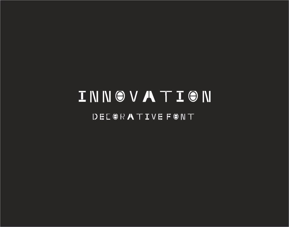
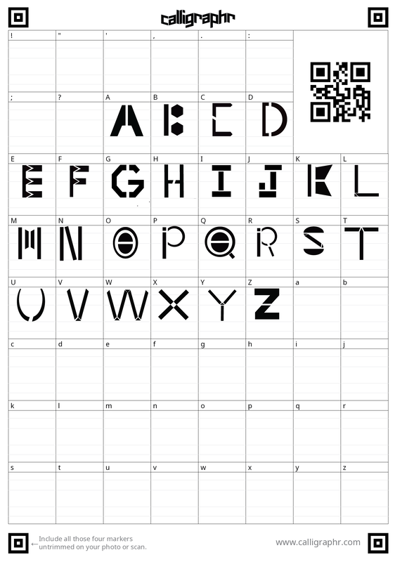
I chose this word because it shows off the name of the font and it also represents the future. This is to encourage designers with created something bigger than themselves, creativity has no limits.
* It can only be used for decorative purposes
* It can only be used for decorative purposes
#2
- Innovation is a font create by the famous designer Matthew, he created this font for events. This font was created in the 2000's to express the evolution in the world.
- My font will be used in fancy dinner(s), event(s), and much more
- My font will be used to solve the font crisis when it comes to events and much more, it will also be used to inspire the world to express their inner creativity
- What makes it unique is that this font is new and it will truly shock the world
- My inspiration is from the font "Cinder", this font truly spoke to me and I like how it looked
- My font will be Sans-Serif
- It will be more geometric because I want it to look fancy yet not really
- My typeface will be suitable for long documentation and it will display a face with an imaginative style that works better with commanding attentions and this font will be useable with a larger size.
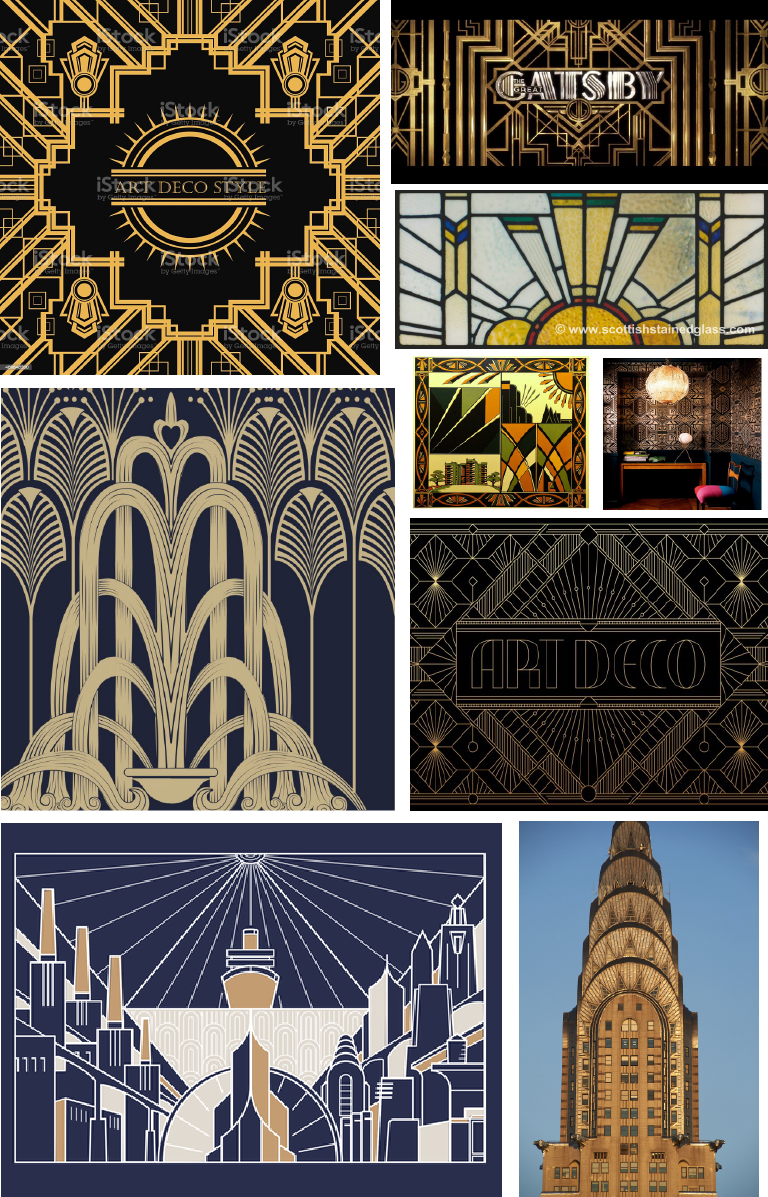
MOOD BOARDS
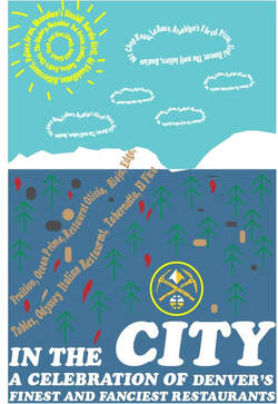
I chose this location because I was born in Colorado and it holds significant value to me.
So I chose a white on blue to represent the mountains along with the snow and added any minor details like the tree, rocks, cloud and a trail.
My favorite part of this book cover would probably be the nuggets logo because it looks cool.
Well, I would change some parts like the trees because it isn't as detailed. Another thing I would change about this project is the snow because the snow look weird at one part.
